6 Aesthetic Color Palettes to Use for Your Next Bullet Journal Spreads
If you’re anything like me, you’re the type of person who needs some decoration in their bullet journal or planner to entice them into actually using the dang thing.
The issue after that is the sheer amount of choice when it comes to decoration. What stickers should you use? Do you have washi tape that matches? What about markers and highlighters??
It can be tough to come up with a cohesive set of decoration for your bullet journal theme, especially when you’re short on time.
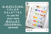
In this post, we’ll go through 6 color palettes using only a few sets of markers or highlighters and I’ll give you some options for decorative stickers that I know match those palettes. If you’re looking for even more color palettes, check out this blog post! So let’s get some color palette choices going so we can get to what’s important: knocking those to-do’s off our list!

Supplies Used
While you can of course use any markers and highlighters you already have, if you’re looking to have a perfect color match with the color palettes in this post, these are the supplies I used below:
- Crayola SuperTips Markers (50 pack) link is to 100-pack since the 50-pack is currently unavailable
- Sharpie S-Note Highlighters (24 pack)
- Zebra Mildliners (15 pack)
By the way, these aren’t affiliate links, I just love these products!
Color Palette 1: Twinkling Planets

 |
 |
This calming set of purples and blues is perfect for a celestial or galactic theme, like these Twinkling Planet stickers!
Color Palette 2: Autumn Gourds

 |
 |
Filled with warm browns, oranges, and red, this color palette matches perfectly with fall and in particular with these Autumn Gourd stickers.
Color Palette 3: Curious Pastel Crystals

 |
 |
If you’re going for a pastel witchy vibe, these soft hues will get you these. Pair them with our Curious Gems stickers for an extra witchy aesethetic.
Color Palette 4: Dappled Koi

 |
 |
This color palette is a mix of yellow, oranges, and black to match koi fish with some serene blue and teal colors to evoke calming waters. These colors match really well with our Dappled Koi stickers. You might also be interested in these step-by-step koi pond doodles.
Color Palette 5: Frosty Penguins

 |
 |
Get cozy with these chilly blues, purples, and teals. The pop of black gives the color palette a penguin vibe to go with these Frosty Penguin stickers.
Color Palette 6: Nautical Sea Travels

 |
 |
A sunset beach heavily inspired the oranges, yellows, teals, blues, and brown in this color palette. Picture yourself floating by on a cute sailboat, like the ones in these Nautical Travels stickers.
From Color Overwhelm to Color Palette
All of these color palettes were inspired by sticker sets I’ve made, but inspiration is all around us. Whether you’re looking around you or online, there are tons of colors living together everywhere. If you’re looking for more color palettes, I have some for you here!
If you take inspiration from one of these color palettes for your next bullet journal spreads, I would love to see! You can find me as TabletAndQuill on TikTok, Instagram, and Facebook.
Want to see more of Tablet & Quill? Sign up for our email list. Not only will there be some fun tips and tricks, but exclusive discounts and behind-the-scenes previews not posted anywhere else!
If you liked this post, share it on Pinterest!


