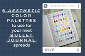
6 Exciting Color Palettes to Use for Your Next Bullet Journal Spreads
If you’re anything like me, you’re the type of person who needs some decoration in their bullet journal or planner to entice them into actually using the dang thing.
The issue after that is the sheer amount of choice when it comes to decoration. What stickers should you use? Do you have washi tape that matches? What about markers and highlighters??
It can be tough to come up with a cohesive set of decoration for your bullet journal theme, especially when you’re short on time.
In this article, we’ll go through 6 color palettes using only a few sets of markers or highlighters and I’ll give you some options for decorative stickers that I know match those palettes to perfection. So let’s get some color palette choices going so we can get to what’s important: knocking those to-do’s off our list!

Supplies Used
While you can of course use any markers and highlighters you already have, if you'd like a perfect color match with the color palettes in this post, you can check out the supplies I used below. Each of these sets comes with a great variety of colors and are all less than $20 USD each at the time of this writing:
- Crayola SuperTips Markers (50 pack) (affiliate link)
- Sharpie S-Note Highlighters (24 pack) (affiliate link)
- Zebra Pen Mildliner Double-Ended Highlighters (15 pack) (affiliate link)
Color Palettes for Bullet Journals
Without further ado, let's get into the 6 color palettes I'll be sharing with you today!
Color Palette 1: Morning Coffee

 |
 |
This adorable color scheme is great for café themes or rustic vibes. This color palette matches perfectly with the Morning Coffee stickers.
Color Palette 2: Berry Patch

 |
 |
Filled with warm and cool berry tones, this color scheme works well with berry themes or flower themes. This color palette matches perfectly with the Berry Patch stickers.
Color Palette 3: Mysterious Detective

 |
 |
Evoking thoughts of tweed, the greens, grays, browns, and a pop of red (for all the red string conspiracy theories) in this color scheme is meant for a detective theme or for a more earthy theme. This color palette matches perfectly with the Mysterious Detective stickers.
Color Palette 4: Paper Stars

 |
 |
This fun color scheme has warm oranges and cool blues which goes well with a lovely paper stars theme or a sunset theme. This color palette matches perfectly with the Paper Stars stickers.
Color Palette 5: Charming Mushrooms

 |
 |
With various earthy tones, this color scheme is great for a cute mushroom theme or a retro theme. This color palette matches perfectly with the Charming Mushies stickers.
Color Palette 6: Poisonous Potions

 |
 |
These bright neon colors remind me of poisonous frogs and potions in dangerous bottles, so of course it would work well for a poisonous potions theme or a groovy theme. This color palette matches perfectly with the Poisonous Potions stickers.
From Color Overwhelm to Curated Color Palette
All of these color palettes were inspired by sticker sets I’ve made, but inspiration is all around us. Whether you’re looking around you or online, there are dozens of colors living together everywhere.
If you take inspiration from one of these color palettes for your next bullet journal spreads, I would love to see! You can find me as TabletAndQuill on TikTok, Instagram, and Facebook.
Want to see more of Tablet & Quill? Sign up for our email list. Not only will there be some fun tips and tricks, but exclusive monthly discounts not posted anywhere else!
If you loved this post, share it on Pinterest!